2013-08-24 3 views
4

У меня есть строка пользовательской переменной, которая может варьироваться от одного слова до нескольких предложений (и может содержать любой допустимый символ Юникода), который я хотел бы отображать в поле переменной ширины.Центр и изменение размера контента

В коде, я хотел HTML, который выглядит, как этот ж/любой другой CSS или JS:

<div style="width: 100%; height: 80%" id="text"> 
    <!--<some more divs or something>--> 
     {{content}} 
    <!--</some more divs or something>--> 
</div> 

{{content}} должны получить больше, когда это может быть, до некоторого максимального размера шрифта (переменной); меньше, когда он доходит до некоторого минимума (переменной), а затем просто обрезается после этой точки.

В любом случае, мне нужно, чтобы он был визуально центрирован, а слова дольше, чем поле, должно быть дефис.

Я пробовал взломать что-то вместе с комбинацией flexboxes и JavaScript, но не мог понять, как получить все исправленные ошибки.

Поддержка браузеров не имеет значения, кроме последних версий браузера Chrome/Safari/Firefox.

mockup boxes @2x

+0

Не могли бы вы предоставить более подробную информацию о том, что вы пытаетесь достичь? скриншот, примеры, jsfiddle? – fernandopasik

+0

уверенный @fernandopasik, см. Обновление –

+0

@AaronYodaiken: Я думаю, вы забыли «проверить» мои ответы. Какие? Я забочусь о своей статистике;) Еще раз спасибо за щедрость. –

ответ

3

Хорошо, я считаю, что это то, что ты хотел сделать. Ниже приведен код с описаниями в блоках комментариев. В chrome вы будете использовать свойство -webkit-line-clamp, в firefox вы будете использовать метод fadeout, поскольку firefox не поддерживает свойство clamp. Вы можете настроить fadeout в css по своему вкусу. «...» в точке отсечки также будет присутствовать в firefox (см. Свойство .clamp:after в css).

Вот обновленный jsFiddle

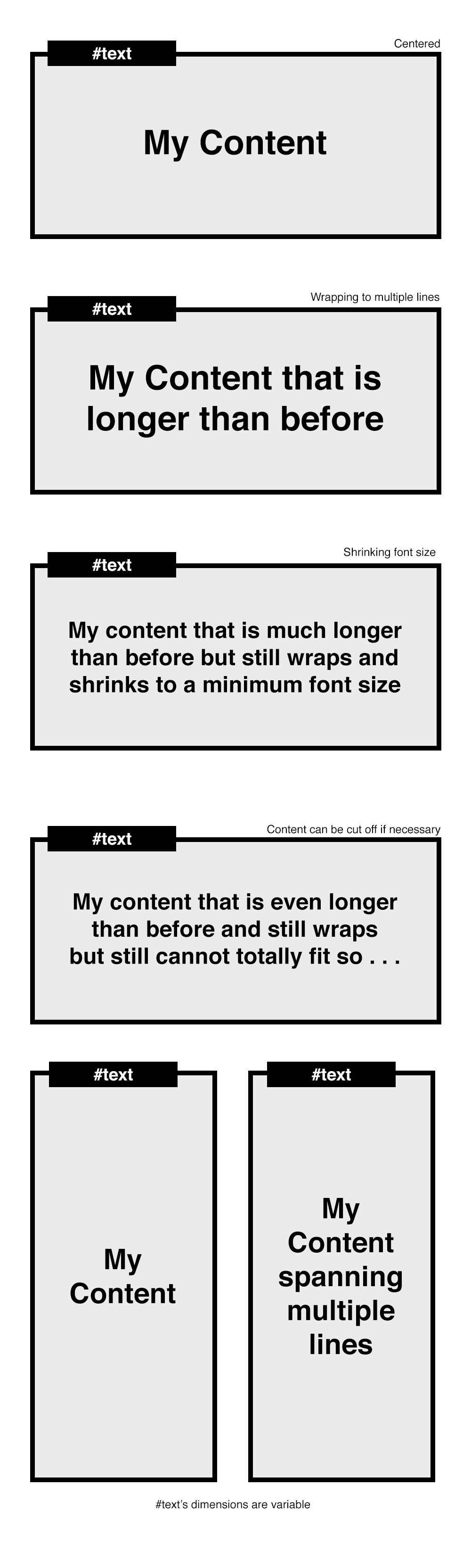
HTML (Чтобы увидеть изменения, просто удалите текст, пока одна строка не отображается в DIV)

<div id="textparent"> 
    <div id="text"> 
     {{content}} adkf kfjg; ;akdfg fbfbf egdf hajkh 
     kajfhdg lakjfg kafd gjkahf jahfkjadlfh alkgj akjdhg fkafg 
    </div> 
</div> 

CSS

Примечание: -webkit- линейный зажим: 3; (Это количество строк вы хотите показать)

#text{ 
    width:100%; 
    position:relative; 
    height:auto; 
    text-overflow:ellipsis; 
    font-size:25px; 
    line-height:1.1; 
    display:block; 
    display: -webkit-box; 
    -webkit-box-orient: vertical; 
    -webkit-line-clamp:3; 
    overflow:hidden; 
    margin:0 auto; 
    box-sizing:border-box; 
} 

#textparent{ 
    margin:0 auto; 
    width:300px; 
    background:#eee; 
    top:50px; 
    padding:10px; 
    height:auto; 
    text-align:center; 
    position:relative; 
    height:100px; 
    display:-webkit-box; 
    -webkit-box-pack:center; 
    -webkit-box-align:center; 
} 

/*FIREFOX will make use of the clamp class*/ 
.clamp:after { 
    background: linear-gradient(to right, rgba(255, 255, 255, 0), #eeeeee 50%) repeat scroll 0 0 rgba(0, 0, 0, 0); 
    bottom: 0; 
    content: "..."; 
    padding: 0 5px 1px 25px; 
    position: absolute; 
    right: 0; 
} 

.clamp { 
    height: 5.6em; 
    line-height: 1.4em; 
    overflow: hidden; 
    position: relative; 
} 

Javascript/Jquery: Основная переменная вы можете изменить или играть с это [min_font_size] и [num_line_to_show], хотя [num_line_to_show] уже установленный в CSS.

var t = $('#text'); 

// get the font-size of the div 
var font_size = Number(t.css('font-size').replace('px', '')); 

// get the line-height of the div (Note: in Chrome this returns the actual height) 
var line_height = Number(t.css('line-height').replace('px', '')); 

// minimum height of #text div 
// 
// Note: if you were in a browser and the line-height var didn't return the full 
// height as it does in chrome, you would need to do this: 
// var min_h = font-size * line_height 
var min_h = line_height; 

// number of lines to show. basically just retrieving the "-webkit-line-clamp" 
// property in the css, otherwise will default to 3, which you can change. 
var num_line_to_show = Number(t.css('-webkit-line-clamp')) || 3; 

// the maximum height for the #text div. (the added 5 at the end is just 
// personal preference) 
var max_h = line_height * num_line_to_show * font_size + 5; 

// get the height of the div 
var h = $('#text').height(); 

// set this if you want the font to be set at a minimum size 
// when the text is longer than one line 
var min_font_size = 20; 

Примечание: Вы можете также попробовать установить минимальный размер шрифта динамически, что-то вроде этого:

// change this to make the font smaller 
var shrink_rate = 3; 
var min_font_size = font_size - (Math.round((h/min_h)) * shrink_rate; 

продолжить:

// for detecting firefox 
var is_ff = navigator.userAgent.toLowerCase().indexOf('firefox'); 

// if the height of the div is larger than the minimum height, meaning there 
// is more than one line now, the font size of the div becomes smaller. 
if (h > min_h){ 
    t.css({'font-size' : min_font_size}); 

    // if in Firefox browser 
    if(is_ff > -1){ 
     // get the new max height of #text based on the number of lines 
     // with the new minimum font-size 
     var txt_max_h = ((line_height-font_size)/num_line_to_show) * min_font_size * num_line_to_show; 

     // the new height is greater than the maximum height allowed for the 
     // smaller font size 
     if (t.height() > txt_max_h){ 
      // reset the height of #text div to a fixed height 
      t.height((min_font_size * num_line_to_show) + 5); 

      // add the clamp class and css will the rest 
      t.addClass('clamp'); 
     } 
    } 
} 

// if firefox, always run this to center the #text div based on its height 
if(is_ff > -1){ 
    t.css({top: ($('#textparent').height() - t.height())/2}); 
} 

Надеется, что это помогает!

+0

Это выглядит фантастически - в Chrome он делает именно то, что мне нужно. Есть ли способ заставить его по крайней мере потерпеть неудачу в последнем Firefox? Это то, что он сейчас делает: https://www.dropbox.com/s/rs8bo79vqisxmc6/Screenshot%202014-05-12%2009.44.29.png –

+0

Да, я обновил сообщение с кодом для Firefox и ссылкой на обновленная скрипка. – alex

+0

Вы получили его на работу? – alex

0

Центральная часть очень легко, вы можете сделать это с Flexbox, дисплей: стол-клетки, и т.д.

Размер шрифта часть сложно, но это был дан ответ в прошлом здесь: https://stackoverflow.com/a/6112914/1877754

3

вовремя.

См. Это Fiddle.

Я думаю, что мне удастся сделать то, что вы хотите. Он работает с Chrome, Firefox и Safari.

HTML:

<div id="container"> 
    <div id="text">my Text !!</div> 
</div> 

JS:

var maxFontSize=68; // I think we cannot have bigger than that. 
var minFontSize=12; 
$('#text').on({ 
    // setting an event to resize text 
    resize:function(e){ 
     // if no text => return false; 
     if (!$(this).html().trim()) return; 

     // if already running => return false; 
     if (this.running) return; 

     this.running = true; 

     // get max-height = height of the parent element  
     var h = $(this).parent().height(); 

     // clone the text element and apply some css 
     var clone = $(this).clone() 
           .removeAttr('id') 
           .css({'font-size':0, 
            'width':$(this).width(), 
            'opacity':0, 
            'position':'fixed', 
            'left':-1000}) 
           .appendTo($('body')); 

     // Set the max font size for the clone to fit the max height; 
     var fontSize = minFontSize; 
     do { 
      $(this).css('font-size', fontSize+'px'); 
      fontSize=fontSize+1; 
      clone.css('font-size', fontSize+'px'); 
     } while (h > clone.height() && maxFontSize > fontSize) ; 

     // Set the '...' if still bigger 
     //start by setting back the good size to the clone. 
     fontSize=fontSize-1; 
     clone.css('font-size', fontSize+'px'); 

     // while max-height still bigger than clone height 
     if (h < clone.height() && minFontSize == fontSize) { 
      var content = clone.html(); 
      // try to remove the last words, one by one. 
      while (h < clone.height()) { 
       content = content.replace(/(\s[^\s]*)$/g,'...'); 
       clone.html(content); 
      } 
      // then replace the #text content 
      $(this).html(clone.html()); 
     } 

     // then remove the clone 
     clone.remove(); 

     this.running = false; 
    } 
}) 
.trigger('resize'); 
0

Там является кросс-браузер (IE9 +) CSS в центре текста и переносы для webkit, codepen:

HTML:

<div class="box"> 
    <p> 
    You can also position your element only in the vertical or horizontal. 
    This work in IE9+. This text can be also hyphenated. 
    </p> 
</div> 

CSS:

.box { 
    border: #3071a9 solid 1px; 
    position: absolute; 
    top: 50%; 
    left: 50%; 
    -webkit-transform: translate(-50%, -50%); 
    -ms-transform: translate(-50%, -50%); 
    -o-transform: translate(-50%, -50%); 
    transform: translate(-50%, -50%); 
    color: #222; 
    font-size: 26px; 
    font-family: arial; 
    height: 50%; 
    padding: 20px; 
    width: 50%; 
} 
.box p { 
    text-overflow:ellipsis; 
    display: -webkit-box; 
    -webkit-box-orient: vertical; 
    -webkit-line-clamp:3; 
    overflow: hidden; 
    position: absolute; 
    top: 50%; 
    -webkit-transform: translate(0, -50%); 
    -ms-transform: translate(0, -50%); 
    -o-transform: translate(0, -50%); 
    transform: translate(0, -50%); 
} 
0

Jquery Textfill Plugin Расс Painter может пригодиться.

Адрес Fiddle.

<div> 
    <div> 
    <label for="dyntext">Content:</label> 
    <input type="text" id="dyntext" value="Hello!"></input> 
    </div> 
    <div> 
    <label for="maxsize">Maximal font size in pixels?</label> 
    <input type="text" id="maxsize" value="0"></input> 
    </div> 
    <hr /> 
    <div class="content"> 
    <div class="jtextfill"> 
     <span class="dyntextval">Hello!</span> 
    </div> 
    </div> 

function update() { 
    var size = parseInt($('#maxsize').val(), 10); 
    if (!isNaN(size)) { 
    $('.dyntextval').html($('#dyntext').val()); 
    $('.jtextfill').textfill({debug: true, maxFontPixels: size}); 
    } 
} 

$(function() { 
    $('#maxsize').keyup(update); 
    $('#dyntext').keyup(update); 
    update() 
}); 


.content .jtextfill { 
width: 150px; 
height: 100px; 
background-color: #fff; 
text-align: center; 
border:1px solid #333; 
padding-top:40px; 
padding-bottom:40px; 
} 
Смежные вопросы