0
У меня возникла небольшая проблема, и я не могу понять ее. Конечный результат, который я ищу, когда поле висит, границы должны анимировать, чтобы создать рамку, которая выглядит так. - прикрепленное изображение 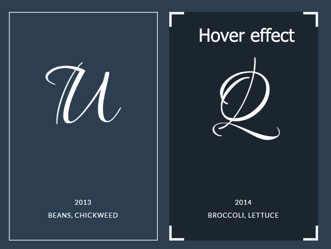 Пограничная анимация CSS
Но фактический результат, который я получаю, отличается. Граница не делает идеальной рамки. Это мой код.
<section class="services">
<div class="grid">
<div class="box">
<svg xmlns="http://www.w3.org/2000/svg" width="100%" height="100%">
<line class="top" x1="0" y1="0" x2="900" y2="0"></line>
<line class="left" x1="0" y1="260" x2="0" y2="-520"></line>
<line class="bottom" x1="300" y1="260" x2="-600" y2="260"></line>
<line class="right" x1="300" y1="0" x2="300" y2="780"></line>
</svg>
<div class="icon-wrapper"><i class="fa fa-users custom-icon"><span class="fix-editor"> </span></i></div>
<p>text</p>
</div>
<div class="box">
<svg xmlns="http://www.w3.org/2000/svg" width="100%" height="100%">
<line class="top" x1="0" y1="0" x2="900" y2="0"></line>
<line class="left" x1="0" y1="460" x2="0" y2="-920"></line>
<line class="bottom" x1="300" y1="460" x2="-600" y2="460"></line>
<line class="right" x1="300" y1="0" x2="300" y2="1380"></line>
</svg>
<h3>text</h3>
</div>
</div><!-- /grid -->
</section>
Это CSS
html {background:blue;}
.box {
width: 300px;
height:260px;
position: relative;
background: rgba(255,255,255,1);
display: inline-block;
margin: 0 10px;
cursor: pointer;
color: #2c3e50;
box-shadow: inset 0 0 0 3px #2c3e50;
-webkit-transition: background 0.4s 0.5s;
transition: background 0.4s 0.5s;
}

.box:hover {
background: rgba(255,255,255,0);
-webkit-transition-delay: 0s;
transition-delay: 0s;
}


.box svg {
position: absolute;
top: 0;
left: 0;
}

.box svg line {
stroke-width: 3;
stroke: #ecf0f1;
fill: none;
-webkit-transition: all .8s ease-in-out;
transition: all .8s ease-in-out;
}

.box:hover svg line {
-webkit-transition-delay: 0.1s;
transition-delay: 0.1s;
}

.box svg line.top,
.box svg line.bottom {
stroke-dasharray: 330 240;
}

.box svg line.left,
.box svg line.right {
stroke-dasharray: 490 400;
}

.box:hover svg line.top {
-webkit-transform: translateX(-600px);
transform: translateX(-600px);
}

.box:hover svg line.bottom {
-webkit-transform: translateX(600px);
transform: translateX(600px);
}

.box:hover svg line.left {
-webkit-transform: translateY(520px);
transform: translateY(520px);
}

.box:hover svg line.right {
-webkit-transform: translateY(-520px);
transform: translateY(-520px);
}

.services {text-align: center;}
/* Frame */
.services .box {
background: rgba(0,0,0,0);
color: #fff;
box-shadow: none;
-webkit-transition: background 0.3s;
transition: background 0.3s;
}

.services .box:hover {
background: rgba(0,0,0,0.4);
}


.services .box svg line {
-webkit-transition: all .5s;
transition: all .5s;
}

.services .box:hover svg line {
stroke-width: 10;
-webkit-transition-delay: 0s;
transition-delay: 0s;
}

.services .box:hover svg line.top {
-webkit-transform: translateX(-300px);
transform: translateX(-300px);
}

.services .box:hover svg line.bottom {
-webkit-transform: translateX(300px);
transform: translateX(300px);
}

.services .box:hover svg line.left {
-webkit-transform: translateY(260px);
transform: translateY(260px);
}

.services .box:hover svg line.right {
-webkit-transform: translateY(-260px);
transform: translateY(-260px);
}
И это fiddle
Похоже на незначительную ошибку в вашей логике, которая, по крайней мере, так же легко вам понять, как и мы. –