2016-04-25 2 views
0

Я пытаюсь достичь следующей структуры, как показано на картинке: enter image description here
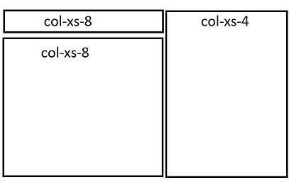
Bootstrap сетка и выравнивание строки проблема

Я хотел бы оба Col-хз-8 и Col-хз-4 начать с той же самой высотой , поэтому я поставил их в один ряд, а нижний col-xs-8 - на другой. Я получаю следующее: enter image description here

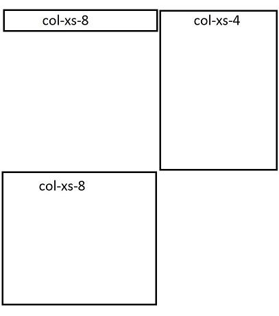
Есть ли способ обойти эту проблему и правильно отобразить оба столбца? Мне также хотелось бы, чтобы оба столбца были точно одинаковой высоты. Нижний col-xs-8 имеет фиксированную высоту. Спасибо!

ответ

1

Добавить pull-right класс ко второму элементу. Этот класс добавляет свойство float:right; к элементу.

<link href="https://maxcdn.bootstrapcdn.com/bootstrap/3.3.6/css/bootstrap.min.css" rel="stylesheet" /> 
 
<div class="row"> 
 
    <div class="col-xs-4 bg-warning">Lorem Ipsum is simply dummy text.</div> 
 
    <div class="col-xs-8 bg-primary pull-right">Lorem Ipsum is simply dummy text of the printing and typesetting industry. Lorem Ipsum has been the industry's standard dummy text ever since the 1500s, when an unknown printer took a galley of type and scrambled it to make a type specimen book. It has survived not only five centuries, but also the leap into electronic typesetting, remaining essentially unchanged. It was popularised in the 1960s with the release of Letraset sheets containing Lorem Ipsum passages, and more recently with desktop publishing software like Aldus PageMaker including versions of Lorem Ipsum.</div> 
 
    <div class="col-xs-4 bg-success">Lorem Ipsum is simply dummy text of the printing and typesetting industry. Lorem Ipsum has been the industry's standard dummy text ever since the 1500s, when an unknown printer took a galley of type and scrambled it to make a type specimen book. It has survived not only five centuries, but also the leap into electronic typesetting, remaining essentially unchanged. It was popularised in the 1960s with the release of Letraset sheets containing Lorem Ipsum passages, and more recently with desktop publishing software like Aldus PageMaker including versions of Lorem Ipsum.</div> 
 
</div>

+0

Совершенных , Спасибо! (: – donfrigo

2
<div class ='row'> 
    <div class='col-md-8'> 
    <div style='background:green' class='col-md-12'>a</div> 
    <div style='background:yellow' class='col-md-12'>b</div> 
    </div> 
    <div class='col-md-4'> 
    <div style='background:red' class='col-md-12'>c</div> 
    </div> 
</div> 

пример https://jsfiddle.net/43tq748r/

+0

Это не работает для меня, так как у меня есть две строки, как в этой скрипке: https://jsfiddle.net/pcnjw6ud/ – donfrigo

1

Попробуйте этот код и увидеть bootplay ссылку:

<div class="row-fluid"> 
    <div class="container"> 
    <div class="col-lg-8 col-md-8 col-sm-12 col-xs-12"> 
     <div class="col-lg-12 col-md-12 col-sm-12 col-xs-12 test"> 
     col-8 
     </div> 
     <div class="col-lg-12 col-md-12 col-sm-12 col-xs-12 test1"> 
     col-8 
     </div> 
    </div> 
    <div class="col-lg-4 col-md-4 col-sm-12 col-xs-12"> 
     <div class="col-lg-12 col-md-12 col-sm-12 col-xs-12 test2"> 
     col-4 
     </div> 
    </div> 
    </div> 
</div> 

/* CSS используется здесь будет применяться после того, как bootstrap.css */

.test { 
    background-color: #ff0000; 
    border: 1px solid; 
    color: #ffffff; 
} 
.test1 { 
    background-color: #000000; 
    border: 1px solid; 
    color: #ffffff; 
} 
.test2 { 
    background-color: #008000; 
    border: 1px solid; 
    color: #ffffff; 
} 

http://www.bootply.com/nR4VPtCzy6

0

Вы можете использовать этот код и применять высоту согласно вашей потребности в каждом столбце.

<link rel="stylesheet" href="http://maxcdn.bootstrapcdn.com/bootstrap/3.3.6/css/bootstrap.min.css"> 
 
<div class="row"> 
 
    <div class="col-xs-8" style="background-color:lavender;"> 
 
     <div class="row"> 
 
      <div class="col-xs-12" style="background-color:lavenderblush;height:50px;">col-xs-8</div> 
 
      <div class="col-xs-12" style="background-color:lavenderblush;height:50px;">col-xs-8</div> 
 
     </div> 
 
    </div> 


    <div class="col-xs-4" style="background-color:lavenderblush;height:100px;">col-xs-4</div> 
 
    </div>

1

<link href="https://maxcdn.bootstrapcdn.com/bootstrap/3.3.6/css/bootstrap.min.css" rel="stylesheet" /> 
 
<div class ='row'> 
 
    <div class='col-xs-12'> 
 
    <div class="col-xs-8" style="height:50px;background:red">col-xs-8</div> 
 
    <div class="col-xs-4 pull-right" style="background:green;height:200px">col-xs-4</div> 
 
    <div class="col-xs-8" style="background:yellow;height:150px">col-xs-8</div> 
 
</div> 
 
    </div>

Смежные вопросы